01 — Intro
AlettermarkthattellswhoIamandhowIwork.Itreflectsmyphilosophy—preciseandessential.
02 — The challenge
Condensing my professional identity into a single mark without slipping into generic territory. The logo had to work as a signature, not a decoration.
03 — The solution
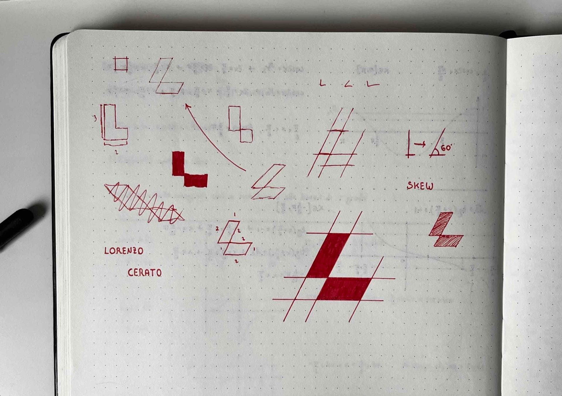
The mark is built on the letter "L", broken into two parallelogram shapes that interact through the contrast between positive and negative space. The construction follows a diagonal grid with constant-angle axes, giving the mark a sense of forward motion. The absence of curves reduces it to pure vector geometry — scalable without loss of legibility from favicon to large format.
04 — Visuals
Scroll to explore the project


Services
- Creative direction
- Logo Design
- Visual system
Stack
- Figma
- Illustrator